Showing posts with label Creative Confetti. Show all posts

Friday, July 24, 2020

Make mine a mini!

Hello all and happy Friday! How is everyone doing this week? Goodness, it has been a LOOOONG time since I've posted on my personal blog. Hosting the Creative Confetti Challenges over at Power Poppy has taken me away from "home" I guess! The card I am going to share today is actually from this week's challenge but I decided I should share here too. :-)

Recently, I scrolled through some of my recent cards and thought about design and what I liked about certain creations and what I didn't love about others. That got me thinking about being inspired. Why not take a card or a series of cards that you love, and downsize them -- make them a mini version?

Let's take a look at my creative process!

First of all, I want to share the inspiration for my mini. A few months back, I hosted the Inspire Me Monday tutorial and mashed up a few techniques to come up with what I call Embossed Silhouette. Ever since that tutorial, I've been looking for new ways to incorporate this look because it is so easy and ushers in dramatic results. So, here's a peek at some of the cards that inspired today's creation. And... HERE's a link to the original tutorial as well. 


And, here's a peek at my "mini!" Instead of using the Power Poppy set Vibrant Thanks, which is currently sold out, I decided to pick one that you could actually get your hands on now! ;-) I chose the stamp set Poppies. 


Instead of making a rectangle card, I decided to use some stitched circle dies to create not only my card base but the layers as well. I folded a 4" by 4" piece of black card stock and then set my die on top, leaving just a sliver of the card at the fold to keep the card's integrity and still have a circle shape. Then, I used one size smaller die for my white layer. And, I cut one smaller from that to serve as my mask so that I could sponge on that bold color.

First up, if you looked at the tutorial link, you know I stamped the poppies stamp in black ink and then colored it all up using a black marker to create a silhouette.


As you can see, I used My MISTI stamping tool to keep my circle in place because after I colored it (I didn't remove it from my MISTI), I inked up my stamp with Versamark ink and then heat embossed using white detail powder to get that detailed silhouette image. Afterward, I lined up my mask and using low tack tape, taped both the mask and the main image down real good so that it wouldn't move as I sponged on the ink. For my ink, I used Morocco and Lady Bug inks by Memento.

And then, the fun continued! Not only did I add a little pizazz to the envelope...


I added a little something extra to the inside of my mini card!


If you missed it, I also make an envelope liner using that pop of orange on the inside...


I added the "Dear Friend" sentiment from the stamp set Heart Abloom and a few iridescent sequins and.. ta da! Finished! I think it turned out so cute and you can still see the inspiration from the original creation. Do you have a "mini" in your future? If so, I hope you join me over on the Power Poppy blog! Every month, we choose a random entry for a $25 gift code to the Power Poppy Shop, just for playing along!

And that, my friends, is it!  Do you need/want a little more inspiration on this Friday to help you get those creative ideas rolling just in time for the weekend? Well, check out these fine ladies and see what they've been up to!

Stacy Morgan
Leslie Miller 

Broni Holcombe

Thanks for stopping by! Until next time!


Friday, February 21, 2020

Friday Fun!

Hi all and happy Friday to you! I have a little Power Poppy fun to share today and I get to also share a little Power Poppy love crafted by some of my fellow Bloomies! Earlier this week, I ushered in the weekly Creative Confetti Challenge and this one is so easy, I really think anyone can join in the fun!

To play along in the challenge and read up on all the details just click HERE. The basic gist of the challenge is to frame up your main image on your card!

On to my creation


I was going through some of my pre-stamped images and found these little die cut flowers from the Abundant Petals stamp set, using the coordinating Die Set as well. And, after I "auditioned" them together, I decided that I had just the right combination to create a bit of color in a card corner. So, I colored it up using Copic markers - R81, R83, RV00, and RV0000 for the petals and YG00, YG23, and YG25 for the leaves.

I took some decorative paper and created a frame by lining up two stitched rectangle dies and, using a Post-It Note, situated and tacked them down on the paper before running them through my die cut machine.

After I cut out the frame, I cut another panel using only the largest die out of this cream and green graph style paper so that it would layer up perfectly. I used the 'Thank You' sentiment from the set and heat embossed it with gold detail powder. 


After I was done with my card, I wondered if it looked a little too plain? So, I did dig into my sequin stash and added a little bit of bling. Not sure which one I like better. What do YOU think?


If you leave a comment, let me know which version you like better -- clean or with a little extra bling! I sure hope you join me in this week's Creative Confetti challenge! I can't wait to see your take on the challenge. Every entry is one shot at a $25 gift code to the Power Poppy Shop! Woo Hoo! 


That's right, some of my fellow stamping sisters have some goodies to share, so make sure you head on over and see.....


I know you won't be disappointed that you did!
Until next time!
Julie

Friday, January 31, 2020

Bloomie Friday and a little Creative Challenge!

Hi all and happy Friday! If you're looking for ways to be inspired in your card making endeavors -- man, I think I have a fun one for you this week! This week's Creative Confetti Challenge that I ushered in earlier this week encourages us all to step out of the card making world to find inspiration from some of the masters in the art world. Look at the scenery, the colors, the graphic impact, the lines, the message. This week's challenge is all about interpretation, and that's why it makes it so much fun! Check it out!


HOW TO PLAY: Scroll through the artwork HERE and be inspired by one of the works. Then, create with that work of art in mind - you might take the look, the colors, the message - it's up to you! There are no hard and fast rules with this challenge! The only thing I ask is that when you post your creation on social media or your blog, share a link to the work that inspired your creation!

On to my creation! When I scrolled through the prints at Art.com, I could see so many opportunities to stretch my creative limits but there was just something about this soft print that caught my eye. It looked dreamy and today, (since the sun isn't shining here) I thought I needed a little soft and dreamy in my life!


I knew it might be tricky to get the perfect image to go along with this scene. I first thought about Power Poppy's Sunset Sway, but after scrolling through my digital stamps, I settled on THIS one, Bubbles and Fizz! I thought the foliage was dreamy like the inspiration art and I thought about the ways I could create that fun tonal backdrop.

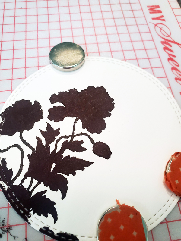
I started by dropping the grey tone image onto a 4.25 by 5.5 canvas in PhotoShop Elements and then moving and positioning two of the images to create the look of foliage coming up from the bottom. After printing, I die-cut and then covered the outer edge of my die cut, right along the stitched edges, with Post-It notes to mask this off from any ink.


Then, I used Copic markers to create the fade of color. I wanted to use Distress Inks at first but I thought masking those little bits and bobbles might be a wee bit too difficult, so... markers it was!  I used G20, BV0000, BG70 and BG72 to create this backdrop. After I was done, I took some slate blue ink and then sponged some ink on using a spotted style stencil. I wanted to create a wee bit of texture to the backdrop. I colored up the leaves and flowers too. I realize my inspiration photo was purple and white flowers but I thought this needed a pop of color. This flower is called a Golden Wattle. It's native to Australia and it truly looks like pom-poms of sunshine! See? (click the link for photos!) 


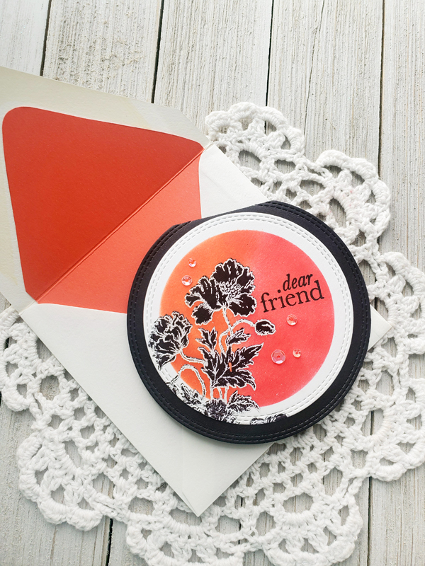
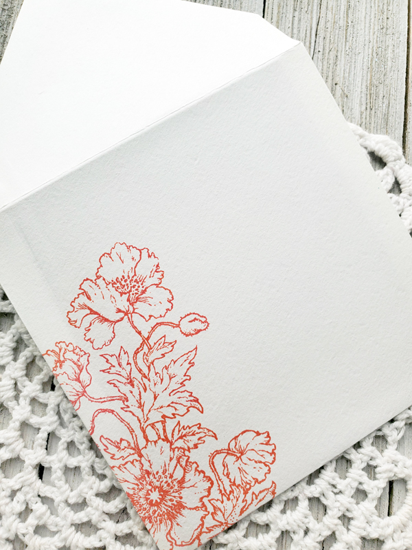
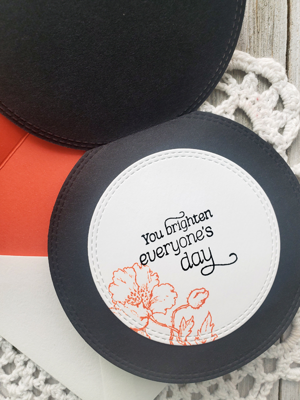
From there, I just matted it all up, picking up on the yellow and sage colored green. The sentiment, which is also a digital image, is from the 
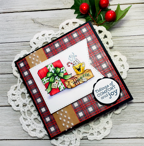
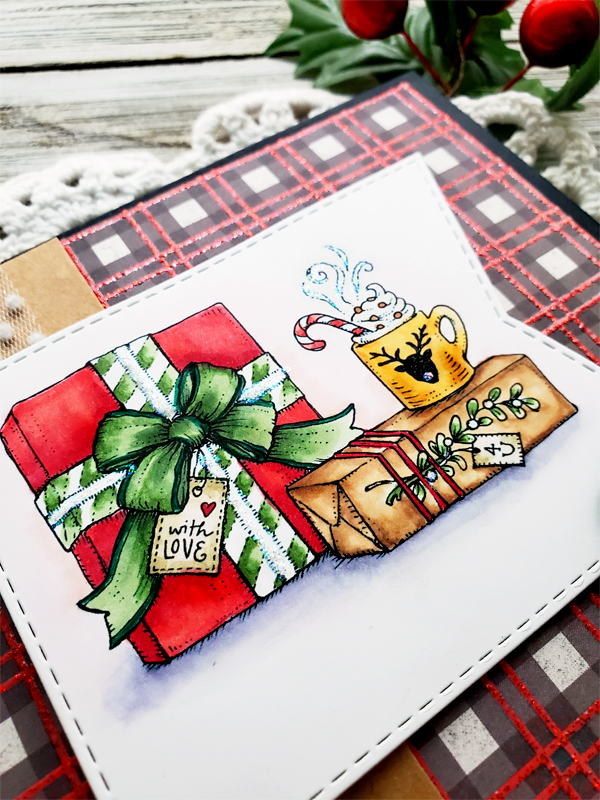
Saucer Magnolia set.   I used a die for the sentiment, punched a hole on each side and then used some gold cording as an accent. Here's a look at the finished card....


And, here's a little close up for you! Of course, I had to add a little splash of glitter to those bubbles to make them a little fizzier! ;-)  I think glitter makes a card happy. Just sayin'!


And that, my friends, is it!   Now, I know if you looked at my card, you might have a hard time seeing the original work but some of the elements are indeed there -- the color fade of a backdrop, and the foliage springing up from the bottom. The similarities after that are few. That's the beauty of this challenge, I didn't say "copy" the work of art. I said, "be inspired by it!" :-)

I hope you do have some creative downtime this week and can join in on the fun of  Life Imitating Art! After you're done, just link up your creation below so we can all see AND so you can have a shot at winning a $25 gift code to the Power Poppy Shop!


Be sure to stop on over and catch a little bit of these ladies' creativity! I know if you hop, skip and jump their way,  you won't be sad you did!

Stacy Morgan
Gloria Stengel is making a guest appearance with a fab Valentine that you'll love!


Have a beautiful and creative weekend!


Friday, January 10, 2020

Friday Fun: Small & Sassy!

Hello all! Since it's Friday, I have some Power Poppy fun to share! If you didn't catch it, I helped usher in a new challenge over on the Power Poppy blog earlier this week and I hope you'll click HERE to check it out! 

Recently, I was in my craft room trying to scale back and organize and I stumbled upon some 4-1/2" square envelopes. They were so cute really. I know, it's an illness when we call an envelope cute but bear with me because those square little envies sparked this challenge! 


To play, all you need to do is, just as the graphic suggests, create a card that's smaller than the typical A-2 size, which is 4.25" by 5.5". Anything goes! You can even choose a different shape. Make it square. Use a die-cut to create a circle card, whatever your little heart desires. Just do one thing -- make it small and sassy! ;-) 

On to my creations!


Being that I had a stack of these envelopes, I thought it might be fun to create not one, but a whole set of cards that maybe I could give as a gift. I have a few friends who really love these for birthdays and low and behold, one of them has a birthday coming up! So, winner, winner, chicken dinner!

I started with the digital stamp set by Power Poppy called Forget-Me-Not Heart. I love this image because the flowers are just as sweet as can be and you can color it up in a jiffy. It made creating four of these cards a breeze! I started by opening up the file and used the heart with the sentiment "Thank You" already placed inside. I grabbed my Copic Markers and went to town coloring! All four cards had leaves colored up with YG00, YG23 and YG25. For the flowers below, I used R81, R83 and R85. All centers of the flowers were colored with Y11 and Y17. Then, when all was done, the centers were dabbed with a wee bit of white gel pen, just for a little extra something!


The petals on this card were colored with B60, B63 and B66. Using the blank Forget Me Not Heart, I added different sentiments to each of the remaining cards. For this one, I used the sentiment from the digital stamp set Pure Prairie Bouquet. 


The petals here took on Y02 and Y11 and the sentiment was from Power Poppy's Easy Breezy Coneflower digital stamp set. 


And this one was colored with BG11, BG13 and BG15. The sentiment was from the Camellias digital stamp set. 


The fun part of creating this little four-card set was that I used four base cards from a set I bought at Michaels that offered up all kinds of colors and patterns in one box set with envelopes. I simply trimmed them all down to create a 4-1/4 by 4-1/4" square -- perfect for my little 4-1/2" envelopes! What I trimmed off the cards, I used as accents on the others. It couldn't have worked out any better! I added some little enamel dots and popped some of the die-cut hearts with foam tape and.. ta-da! I was done! All in all, it only took me a little more than an hour to whip up these four cards and now, I have some on hand for a friend! I will probably make a little coordinating box for these, perfect for gifting!


Want a little more fun this Friday? Be sure to hop on over to Nancy Sheads' home on the web to see what crafty things she's conjured up for you all! 


Until next time, 


~Julie

Friday, December 20, 2019

I'm mad about PLAID!


Hello all and happy Friday! .So are you done with your Christmas shopping? Have all your cards sent and cookies baked? Well, I am not quite there yet but I am getting pretty close! Baking is set for this weekend and I am hoping everything turns out delish! 

Since there is such a hustle and bustle this time of year, earlier this week I thought I would make our Creative Confetti Challenge super dooper easy for everyone to play along! If you missed it, here's the challenge! I hope you join me! I think card making is a definite stress reliever and this is the perfect time of year for that! 

All you have to do is create with a little bit of plaid somewhere on your card or creation! You can click HERE for all the official details! 

On to my creation! 


While I didn't have buffalo check plaid, I did have this sparkly plaid that looks a cousin of that check print! I thought it looked super cozy with the image I chose from Power Poppy's Cozy Cupfuls stamp set. I stamped using Tuxedo Black Memento ink and then colored my image up with Copic Markers sticking with vibrant reds (R32, R35, R37) kraft colors (E51, E53, and E55), shades of gold (Y21, Y32, Y35 and Y28) and then touches of green (YG61, YG63, and YG67). I did add some shading with R0000 and R00 on the top (which you can barely see in the photo) and BV00, BV000 on the bottom. Add a strip of kraft paper, some fun ribbon and a little popped up sentiment and... done!

Here's a little close up for you! As always, Christmas cards need a little glitter! ;-)


And that, my friends is it! Be sure to stop by some of my fellow Bloomies places on the web to see what wonderful things they've whipped up for you all!


Thanks so much for stopping by! I hope you have a blessed holiday season full of joy, wonder and everyone you love!

Until next time!
~Julie

Friday, October 18, 2019

Just Take Ten!

Hello All! Happy Friday! Did you happen to checkout this week's Creative Confetti Challenge? It's a fun... and easy one and involves a kind of card that we should ALL love to create. What card is that? The quickie kind of cards that are fun to whip up but don't exactly look like you just took 10 minutes to assemble! And that, my friends, is what this week's Creative Confetti Challenge is all about!


Let's get on to my creation! 


You can see above that my MISTI stamping tool and Power Poppy's Big Scripts stamp set (on sale now for $9.99)  are two things at the center of my 10-minute card. I also decided to focus on my colors - card stock, ink, embellishments - before I got to creating. I wanted to make sure that everything was a perfect match before I got creating. 


Once I narrowed that all down, I lined up my cardstock in the MISTI and then, after every color, I wiped off my stamp and moved my paper down three lines on my MISTI, keeping my paper vertically even as I went. These inks are all really old colors. Do you remember Vivid! ink? Well, I have the whole line with reinkers and I swear, I have had them for close to 20 years. I remember when I started stamping saving up to buy a few ink pads a month to build up my collection. ;-) Ahhh... memories!

Here's a closeup! You can see, when I was done with the linear stamping, I die cut my wonky rectangle and trimmed the coordinating cardstock to give me 1/8" around the outside. Add some decorative polka dot paper, add a sentiment from the Poppy XL clear set. Add some sequins and... ta da! Done!


This one is an easy peasy design that you can do in almost any color scheme to let a friend know that you are thinking about her! Sometimes the message is more important than the time it took to create a handmade card, don't you think?

So, why don't you try your hand at a quickie card and join me this week? Remember, each and every link up with our linky ON THIS POST HERE is one more chance at a $25 gift certificate to the Power Poppy Shop!  


I know my stamping sister STACY MORGAN has some fun to share with you all! And, if you haven't been over to the POWER POPPY blog yet, Marcy has some exciting news to share, so you'll want to click on over and check that out! Hope you have a wonderful and creative weekend!


Until next time!

~Julie

Friday, September 20, 2019

Bloomie Friday: Over the Edge!

Hello all! Happy Friday to you! Hope your week is ending on an absolute high note! I don't know about you but for me, this week FLEW by! I got a little work in. I got a little play in! And, as you are about to see -- I got in a card for this week's Creative Confetti Challenge! We had the fabulous Barbara Campbell as a guest designer this week and she led the challenge. Here's a peek at what she challenged us all to do!


HOW TO PLAY: Simply make sure that your main image is off the edge somehow! If you want some ideas, you really need to check out Barbara's post HERE to see the two ways she took this challenge. So pretty! 

So, here's a peek at what I came up with! 


So, you can see that I used Power Poppy's Sunset Sway digital stamp and let it creep over the edge ever so slightly! It's not super dramatic, but it is over the edge none-the-less! I used Copic markers to color up this image and, as you can see, I kept things super simple. I am on a really simple kick lately. I plan to send this card to a friend to let her know that I am thinking about her and I thought it would be nice to create a card that was "mail friendly!"

The sentiment is also from the set and I used a punch that notches out the edges and then, in that negative space, I added some super small square rhinestones that matched the green in my image. See?

I really, really love that sentiment. It is like taking a deep breath in my opinion and when you send it to a friend, it's like you are taking that deep breath together -- don't you think?

So, will you join Barbara and go "Over the Edge?" Let's see what you create! Remember to link up your creation HERE for your chance to win a $25 gift code to Power Poppy! 


I do know that the lovely Ms. Stacy Morgan has something to share with you all this week! So, be sure to stop on over and see!


Thanks for stopping by, see you back here soon! 
~Julie 


Friday, August 23, 2019

It's Bloomie Friday!


Hello all! Hope you have had a wonderful week! I don't know how many of you move and sway between your favorite crafts, but I know I do. During some seasons of life, I might spend most of my time stamping. During others, I might whip out the old sewing machine and start a quilting project. Or, most nights, when I watch TV, I have a knitting project in hand. So, for this week's Creative Confetti Challenge, I decided to mix it up and share two of my crafting loves! So, if you want to read all the deets on this week's Creative Confetti Challenge, all you have to do is click HERE!  I share how I not only combined stamping and knitting but did so for charity. And.... I encouraged you guys to give that a try!

On to my creation! 

You might be asking yourself what on earth does a knitting project have to do with this week's challenge? Let me explain! Last Friday, I got a note from my local yarn shop saying that they were going to start taking donations for a program called Casting For Recovery.  The non-profit hosts retreats -- fly fishing retreats -- for women with breast cancer who are on the road to recovery. Just a little bit about Casting for Recovery, did you know that fly fishing -- the gentle motion of casting can be a little like physical therapy? That, along with being with other women going through the same thing, AND being out in some gorgeous countryside is what the program is all about. 

So, to make a long story even longer, my local yarn shop was collecting cowls that the women could be gifted during their September retreat in Bozeman, Montana. So, I got knitting right away and whipped up this cowl using THIS pattern (Broken Rib Cowl) and it came together after just a few nights of TV watching. I will mention, the color scheme is not what I would have chosen but the yarn shop owner said it was earthy and even had some of the same colors as a brown trout -- so, I snatched it up! I am going to raid my yarn stash and whip up a few more. I'm thinking THIS one looks fun too! Or, maybe THIS one! ;-) 

And you can see, this is where my challenge comes into play! I wanted to make a tag to go along with my gift and I chose Power Poppy's Leapin' Trout digital stamp. I sized it so that I could use my 2-1/2" circle punch and added the words "Handmake just for you!" 


I colored the fish up with Copic Markers using YG91, YG91, Y32, R81, R83 R85, and BG72 and BG000 for the water. I also added some white gel pen for the splashes! 

And here's what I printed on the other side. Since the yarn is 100% Merino, I wanted them to know that this is a hand wash in cool, lay flat to dry kind of accessory. The good news is, it's soft to the touch and hopefully nice around a woman's neck! I will also add a nice little note letting her know I am sending blessings for her on her road to recovery. 


And that, my friends, is it. Just a little project that is super quick but from the heart none the less! So, take my lead -- create with nature in mind (like my leaping trout!), create a tag, or create with a charity in mind! Just that simple!

Thanks for stopping by y'all! I hope you have a fabulous week and remember, to play along, all you need to do is create, link up your card HERE. Once a month, Power Poppy draws one random and lucky stamper to win $25! Can't wait to see what you come up with.  

Want to see what one of my fellow Bloomies whipped up for all of you this week? Stop on over and see.....


I know you won't be disappointed that you did! 

Until next time!
~Julie 

Friday, August 9, 2019

Gettin' Krafty on a Friday!


Hello all and happy Friday! How is your week wrapping up? I tell ya, mine sped by. It seems summer has a way of doing that, eh? This week was a tough one for me because my firstborn, who I still consider my baby boy, officially flew the coop. This was a picture of him just before he pulled away en route to Portland -- new city, new job. Meanwhile, I was truly testing the strength of my waterproof mascara. Ugh.... doesn't matter how old they get, they are still your babies!


Needless to say, I decided earlier this week to spend a little time in my craft room -- after all it is kind of like the comfort food of rooms in my home. Don't you think? I had fun ushering in the Creative Confetti Challenge earlier this week and urged everyone to Get Krafty! You can check out all the deets HERE but the long and short of it is that in order to play along, you just have to use kraft colored cardstock on your creation or, in my case, as the base for my main image!

So... on to my creation! 


For my challenge card, I decided to color up the floral vase grouping from Power Poppy's Fortune of Fall stamp set! It's just such a warm and inviting illustration that I think it will be great to have on hand for cards this upcoming fall.

I started by stamping on my kraft cardstock by using Versafine Black Onyx ink and then heat set it before I dove in and started to color with my Prismacolor pencils. Here is a trick that I did to start. I used my MISTI stamping tool to stamp my initial image. Then, I took time to color. You can see with the image below, some of the crispness of the image was lost. You can really see on the white petals and white vase....


That's why I love the MISTI stamping tool folks! Because, I just lined up my image again right up in the corner, inked up my stamp and stamped right on top! Look at those crisp lines emerge once again!


I will say that because I was using pigment ink, and I had a waxed base medium with my colored pencils, I did have to lay a scrap paper overtop to rub off some of the ink that was just sitting on top of my image. See?


It ended up picking up quite a bit of ink. I thought that If I didn't do this, I might actually have enough ink laying on top that it could either muddy my image or smear. Neither one is a good thing! After that, I layered everything up, keeping my layout simple. I added a little sentiment flag as well using one of the sentiments from the set and... tada! Fini!

Here's a closeup of the coloring for you all!


And that, my friends, is it! So, let's see what you've got in this little "krafty" challenge! Remember to click the link above for all the details. Hope you join me!


Julie Koerber >> you are here! 


Thanks for stopping by! Until next time, happy stamping! 

~Julie

Friday, July 26, 2019

Take my color cues!

Hello all and happy FRIDAY! Hope your week is ending on an absolute high note! If you didn't tune into the Power Poppy blog earlier this week, you might have missed the challenge I ushered in! It was all about color! I thought I'd share the latest in Creative Confetti challenge here on my blog too! So... the challenge asked you to be inspired by my photo, use the colors in a card and... post it! Just that simple folks!

Here's a peek at the color combo! 


My family and I were out at our minor league baseball field catching the Billings Mustangs in action when this sunset played across the sky. It was breathtaking yet fleeting but thankfully, I had my phone and grabbed a snap!

And here's a look at my creation! 


You can see the base color scheme above! I used Power Poppy's Go Wild clear stamp set and then colored it all up with a mix of Copic Markers. I used RV32 and RV34 for the pink flower. The greens were YG03, YG24 and G20. And, the water was a mix of BG0000, BG0000, BV0000, and BV00. The window panes were brought to life with B60 and B63. You can't see in the photo above but I added some R0000 and V0000 along with BV00 around the edge of my image for some depth. 

You can see it a little better below! 


And, here's a peek inside. I used Ranger Cool Peri ink to add a little floral bit at the top and the bottom. The sentiment is also from the Go Wild stamp set! 


And that, my friends, is it! Want to join me this week? Simply create, post HERE ON THIS BLOG POST! As I always say, if you get those fingers inky and play along, each and every link is an opportunity to win a $25 gift code to the Power Poppy Shop! Woo Hoo!

And, just a side note! If you head on over to the Power Poppy Blog HERE today, you might have a shot at a $10 discount code to the Power Poppy Shop! So, click on over and see what the excitement is all about!


Make sure you check out this fine lady below! I know she's serving up some Power Poppy Goodness on her blog today!


Well, my sweet stamping friends, I hope you play along with me this week! Thanks for stopping by!

Until next time!
~Julie 
Linkz code -->